People are overwhelmed by the sheer number of skincare products, ingredients, and opinions online. With conflicting advice and endless options, users often guess their way through routines — leading to wasted money, poor results, and even worsened skin health.
Epidara is a conceptual AI skincare assistant designed to simplify decision-making. The app analyzes a user’s skin concerns and habits through an AI facial scan and intuitive onboarding quiz, then provides clear, personalized routine recommendations. The goal: help people feel more confident, informed, and supported in their skincare journey.
Research
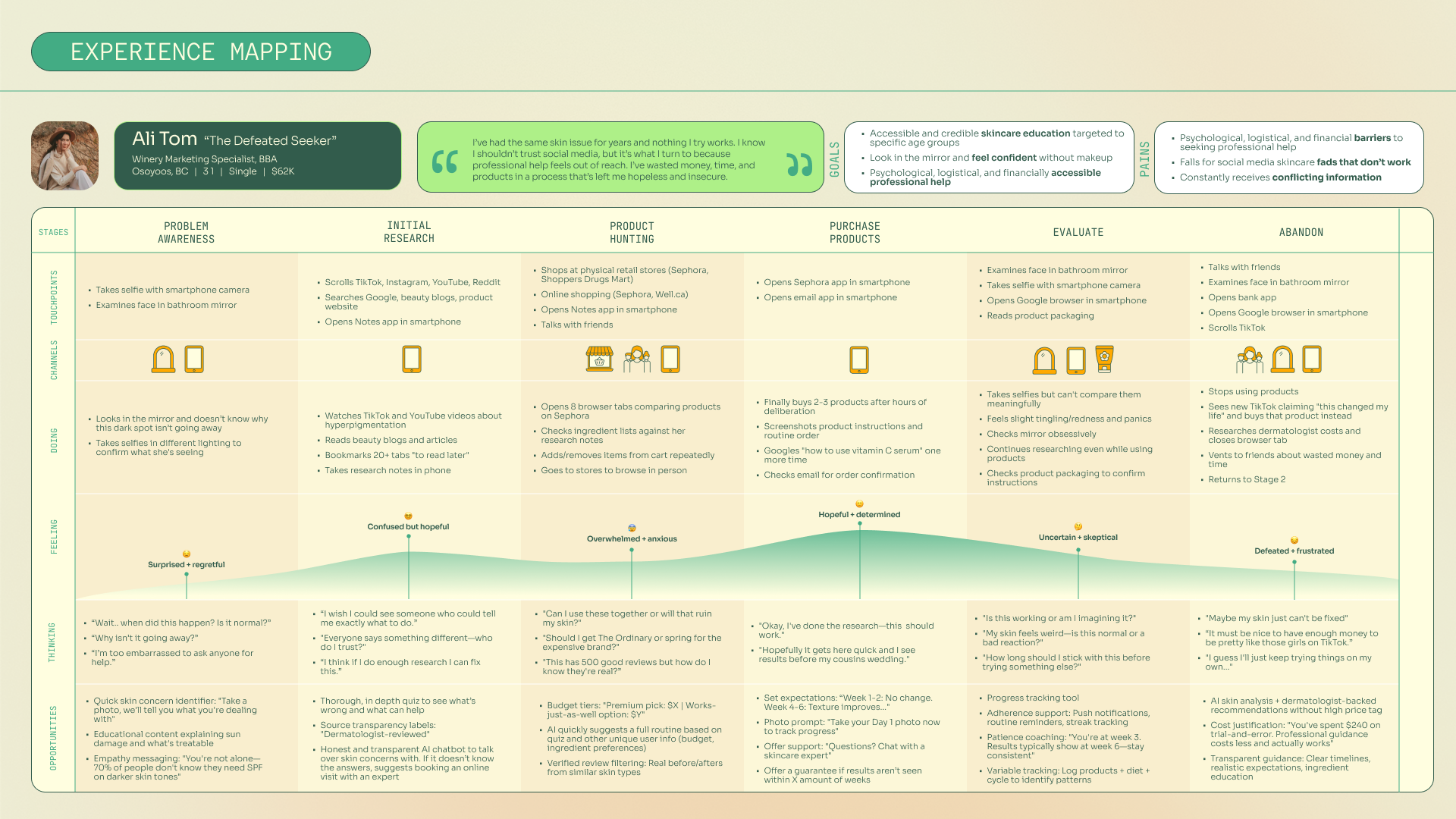
I began by conducting secondary research and a competitive analysis to verify assumptions. Then, I conducted user interviews and surveys to identify the core user pain points around overwhelm, mixed messages, and the trial-and-error nature of skincare.
Learning #1
The research led to a clear problem statement and "how might we" statement. As well as a persona and user experience map for the persona that helped guide the design process. It also defined opportunity for AI assistance in the skincare industry.
User Flow + Task Analysis
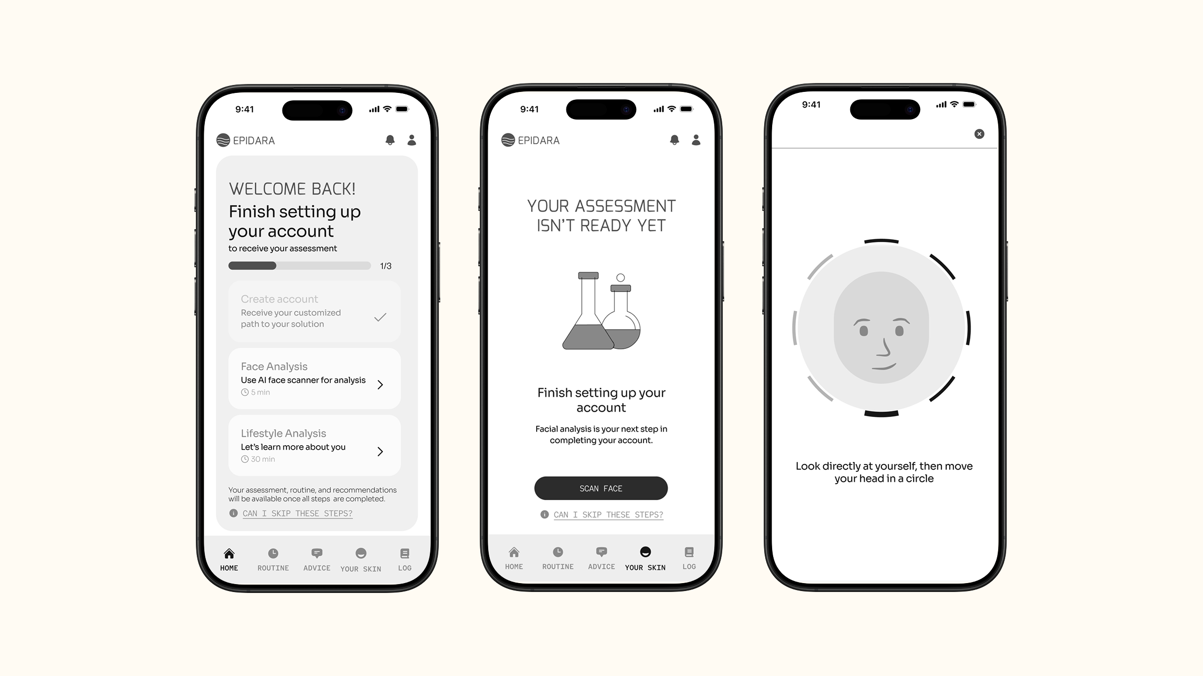
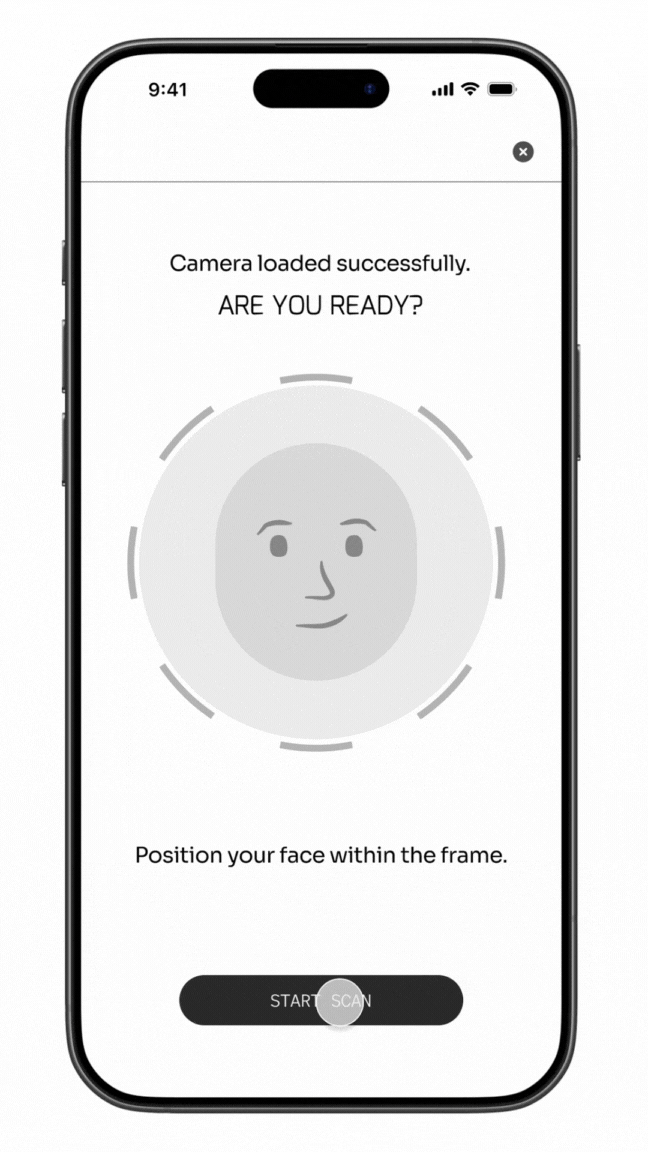
For the prototype, I focused on one core task: completing the AI facial analysis for the first time.
Learning #2
This analysis was essential for capturing the data needed to generate AI-powered recommendations personalized to the user without task overwhelm.
Sketching + Wireframing
Once I had decided on a user flow, I started sketching frames on my iPad. Those frames helped me decide what components and UI elements would help users navigate the app and reduce noise and confusion.
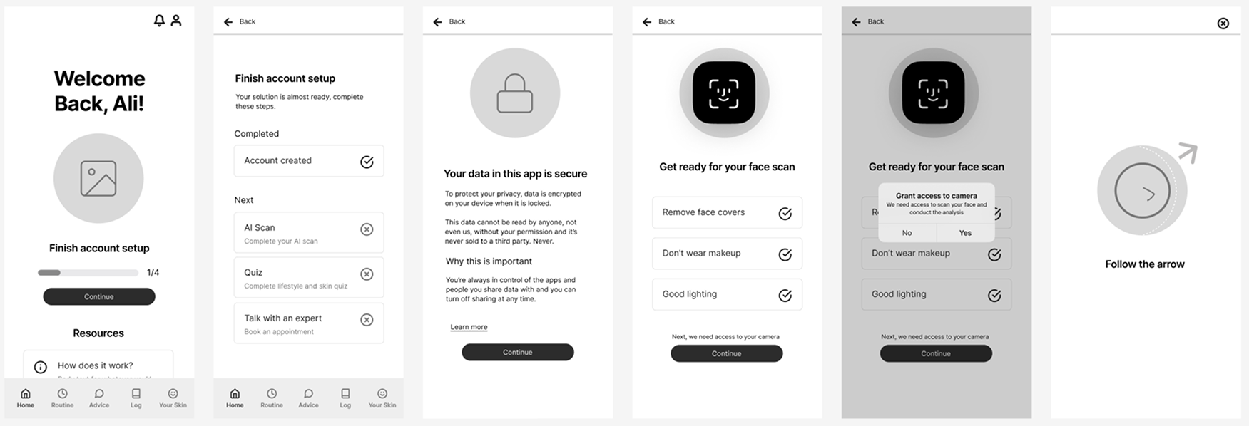
Wireframes | Version 1
User Testing
I used my wireframes from version 1 to conduct my first round of user testing to identify any gaps or confusion early in the process.
For the test, users were asked to complete the next step in the account creation process, complete a face scan, and then save-and-exit. However, the face scan was meant to fail the first time to evaluate how a user would handle that situation.
Learning #3
The usability tests identified three areas that needed to be addressed and I created a Design Prioritization Matrix to determine if they should be fixed in my next iteration (see matrix below).
- Regranting camera access was redundant after scan fails.
- Users wanted to continue setup process instead of save-and-exit and would get confused (however, this said more about the test than the app).
- Account setup steps that are inactive felt too exclusive and didn't sit well with one tester.
The first issue was a very low effort, high value fix. Therefore, the second design iteration removed that step.
The second issue was determined to be more of a testing issue than a design issue. Therefore, I knew that in future tests, I needed to be more clear of the task before the testing started.
The third issue was not addressed in the next iteration of my design. However, I did want to investigate that feeling of exclusivity closure, to determine if it was a common feeling of inactive interaction states.
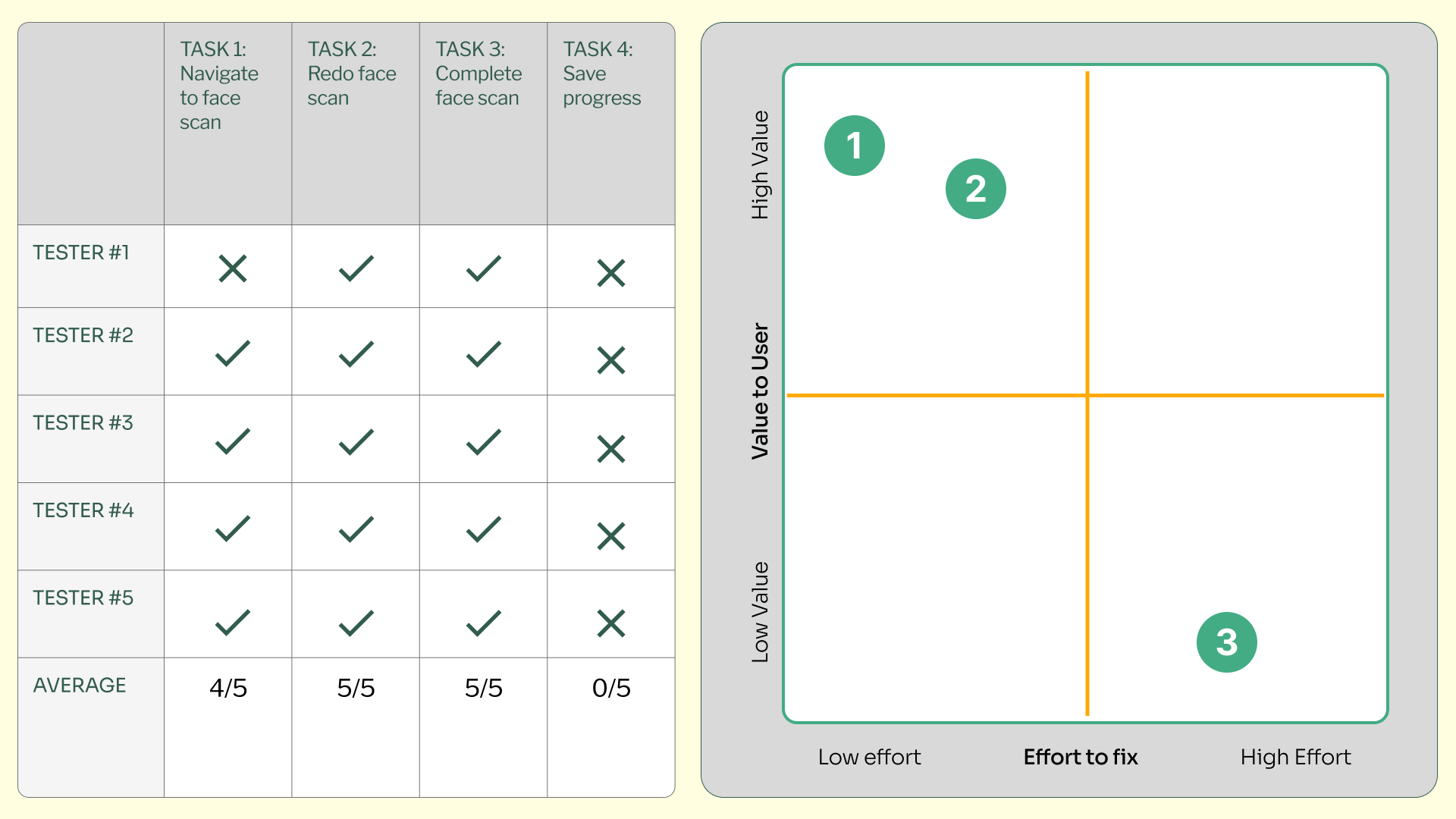
User test results
The final concept showcases how AI can provide clarity in an otherwise confusing product landscape. The prototype demonstrates a smooth, supportive onboarding experience that feels both modern and trustworthy.
This project highlights my ability to take an abstract idea from concept to brand to functional UX flow — blending strategic thinking, interface design, and storytelling.
Explore Prototype