Methodology
We conducted a comprehensive heuristic evaluation using Nielsen's 10 usability principles, mapping a task flow from the home page through to completing an online class. We rated severity levels from cosmetic issues to major problems and catastrophes.
The Challenge?
At the time of the sprint, lululemon’s app had over 163K reviews in the Apple App store and a rating of 4.9/5. So, we had to review the user flow many times and with very careful eyes to identify issues.
Key Findings
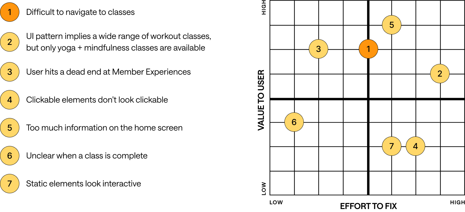
By the end of our evaluation, we revealed seven usability issues across four key areas of the user flow. Here are four of them:
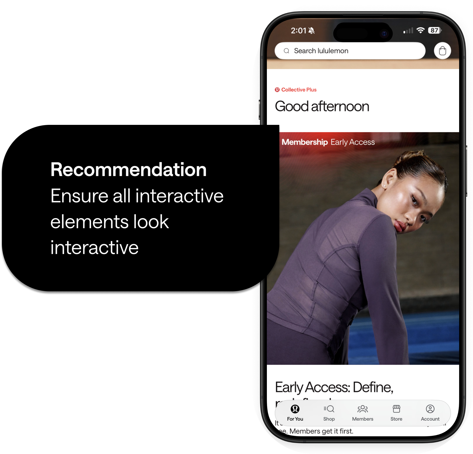
The "Good Afternoon" header looks static but functions as a button, breaking user expectations.
Home Screen Issue
Usability Heuristic #4:
Consistency and Standards

Visual clutter adds to unnecessary noise and buries important features.
Home Screen Issue
Usability Heuristic #8:
Aesthetic and Minimalist Design
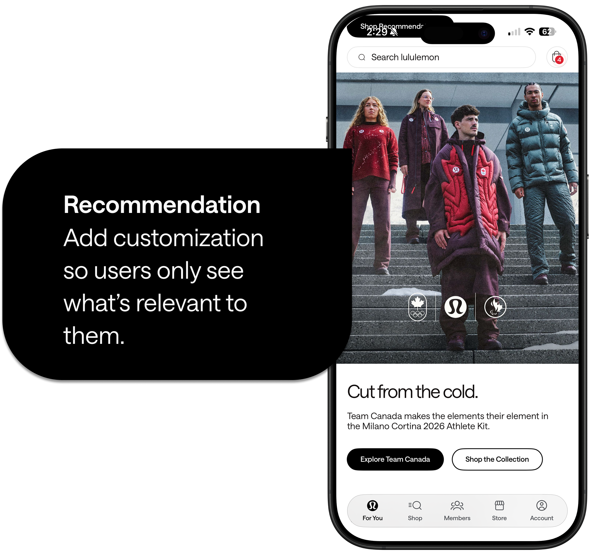
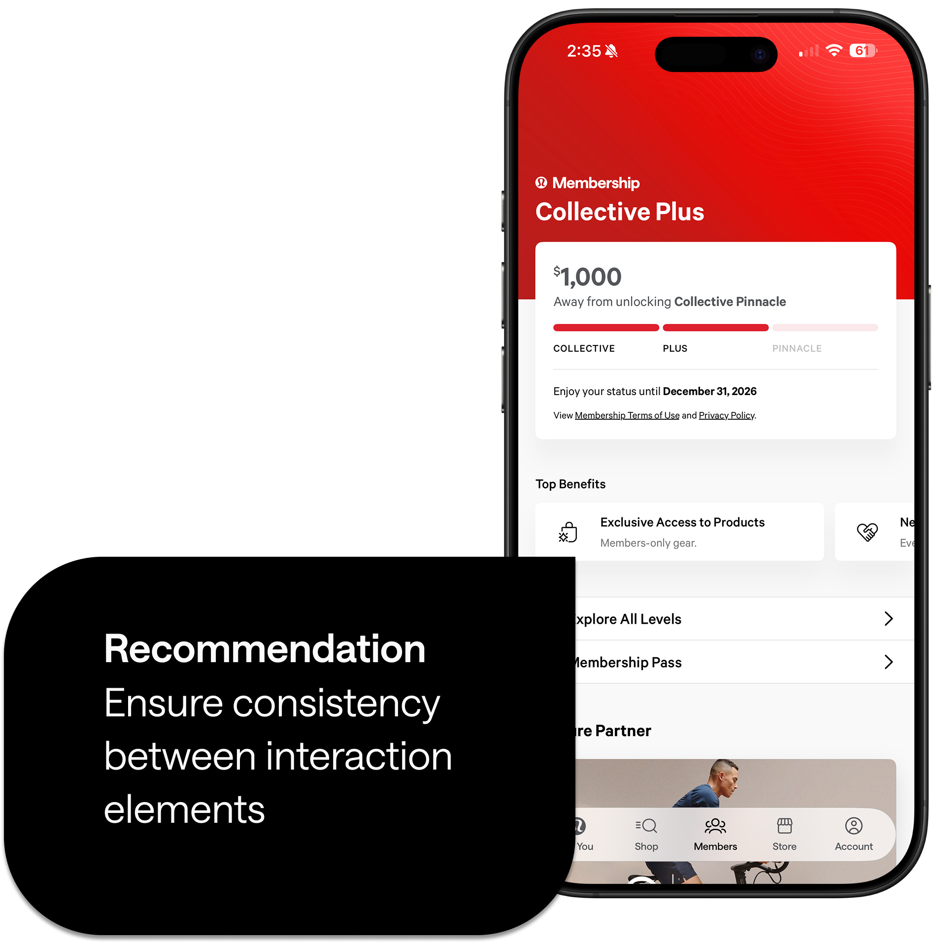
Top Benefits cards appear interactive but are static, creating inconsistency.
Members section Issue
Usability Heuristic #4:
Consistency and Standards
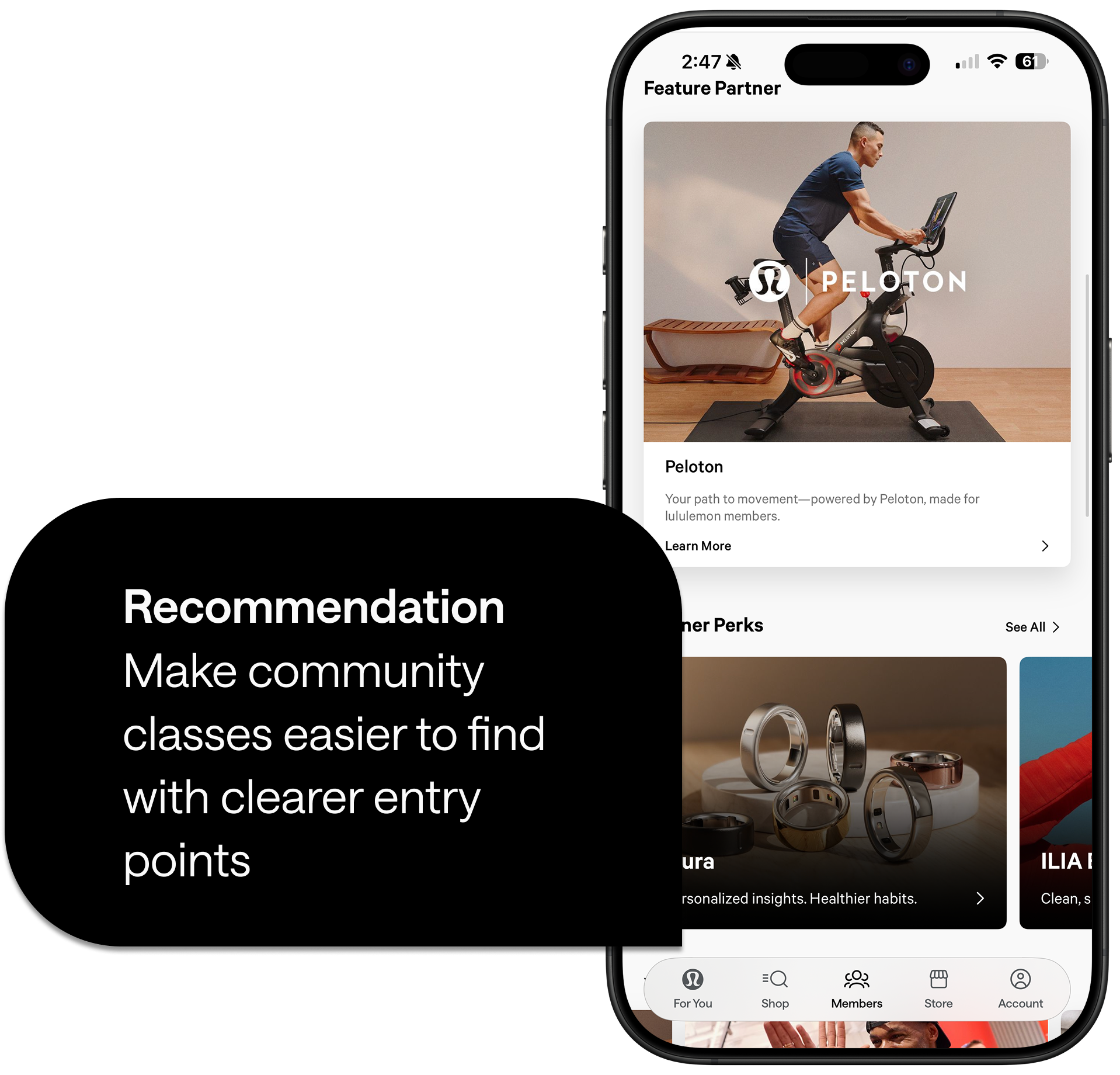
Movement classes had zero visibility on the home screen and there were too many steps required to reach a class with no shortcuts or alternate paths
Class discovery Issue
Usability Heuristic #7:
Flexibility + Efficiency of Use

Prioritization
We mapped these issues using a design prioritization matrix (value to user vs. effort to fix). Our focus centered on high-impact, low-to-medium effort improvements that eliminate confusion and remove dead ends in the movement journey.
Goal 1: Make Discovery Effortless
Create clearer entry points so users can discover classes without guesswork.
Success metric: More users successfully discover and explore classes.
Goal 2: Build Selection Confidence
Use simple labels, filters, and class details that reduce uncertainty.
Success metric: Users can select a class or event that fits their needs.
Goal 3: Guide Continuous Action
Add redirection paths and predictable next steps across the movement journey.
Success metric: Fewer users drop off and more continue through the flow.
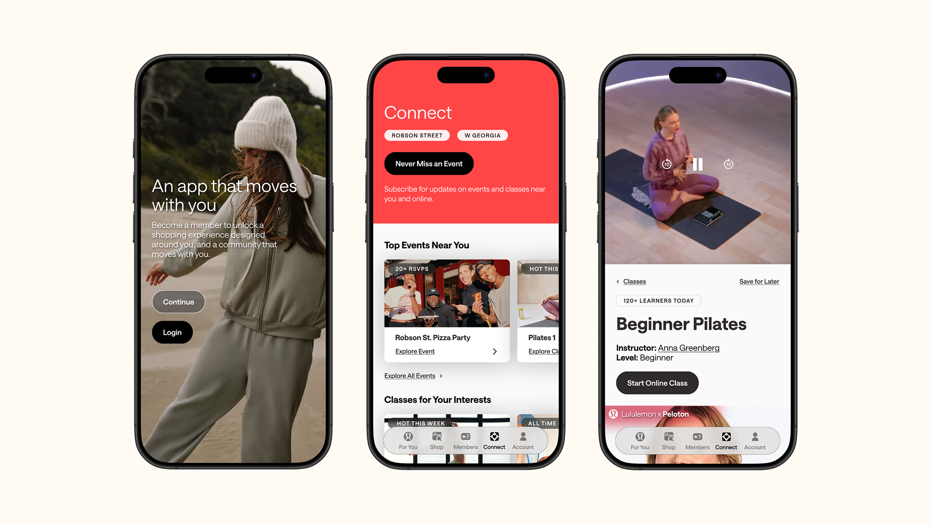
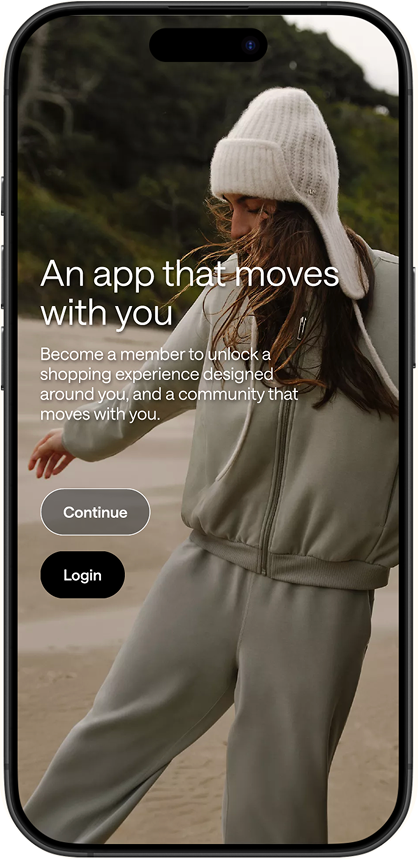
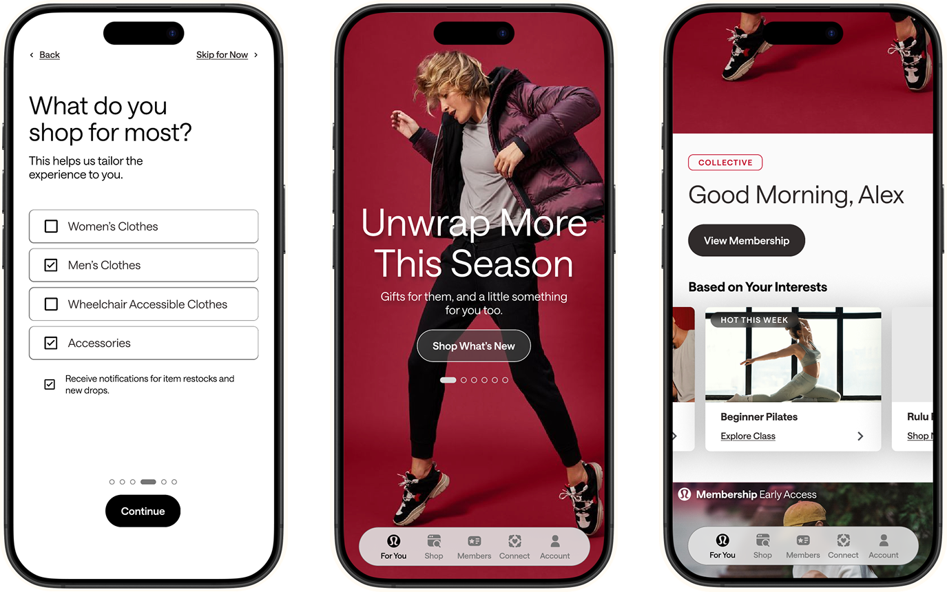
Our solution rethinks how movement content and personalization appear in onboarding and across the app.
Core Design Decisions
Personalized Onboarding
We introduced a guided onboarding flow that asks users what they need help with, how they want to connect, what they want to shop for, and their location preferences for nearby events. This immediately personalizes the experience and surfaces relevant content from the first moment.
Clearer Information Architecture
We restructured the app's navigation into three distinct spaces:
Members: My relationship with lululemon (status, perks, progress, recognition)
Connect: My relationship with others (events, classes, shared spaces)
Account: My control (settings, connected accounts, privacy)
This separation clarifies purpose and reduces cognitive load.
Multiple Entry Points
Classes and events now have visible, accessible entry points from the home screen—no more buried features or circuitous paths.
Redesigned Class Experience
We created class detail pages that help users arrive at a class with confidence, not just press play. We added filters, clear labels, and expectation-setting content.
Completion & Closure
We designed a class completion screen that acknowledges achievement and guides users toward their next meaningful action—whether that's another class, an event, or product discovery.
Eliminating Dead Ends
Every card that looks interactive now is interactive. Every screen offers clear next steps. The Member-Only Experiences page now redirects users to relevant classes or events.
Design Principles
Clarity over novelty
Predictable interactions
Supportive transitions into movement
Contextual personalization that respects user autonomy
Each solution maps directly back to our three redesign goals:
✓ Goal 1 achieved: Users can now easily find community events and classes through visible entry points and personalized onboarding
✓ Goal 2 achieved: Users have confidence choosing the right events and classes through improved labels, filters, and class details
✓ Goal 3 achieved: Users are guided to more meaningful actions through redirection paths, completion screens, and predictable navigationBy bringing lululemon's community-first, in-store experience into the app through onboarding, guests like Alex can feel more supported and connected to the lululemon community as they build their movement journeys.
What I Learned
This sprint reinforced that personalization isn't about adding features—it's about reducing friction and building confidence. The most powerful moments came from eliminating confusion, not from adding complexity. We learned that users don't need more options; they need clearer paths to the right options.
If I Had More Time
- Conduct usability testing with actual lululemon app users to validate our assumptions
- Refine onboarding copy and personalization questions to create an even more personalized experience— explore progressive disclosure
- Explore deeper integrations: saving events to calendars, connecting health platforms (Apple Health, Strava)
- Investigate pairing classes more intentionally with product drops and cart recommendations
- Explore adding lululemon-hosted online classes (not just partner classes)
The Future
Rather than thinking of next steps as just new features, we see them as ways this experience could grow with the guest—becoming more contextual, more respectful, more inclusive, and more supportive over time.
We started with a question: How might we make it easier for users to find what they need and feel confident?
Our answer: Personalization rooted in community. What we learned through this sprint validates that approach. By making lululemon's movement content visible, accessible, and personally relevant, we can help users like Alex make their next move with confidence.