design sprint
Finding flow in the lululemon app
Their retail spaces have always been more than stores — they're gathering spots for classes, events, and real human connection. But as the movement experience shifted digital, that same sense of belonging wasn't translating into the app.
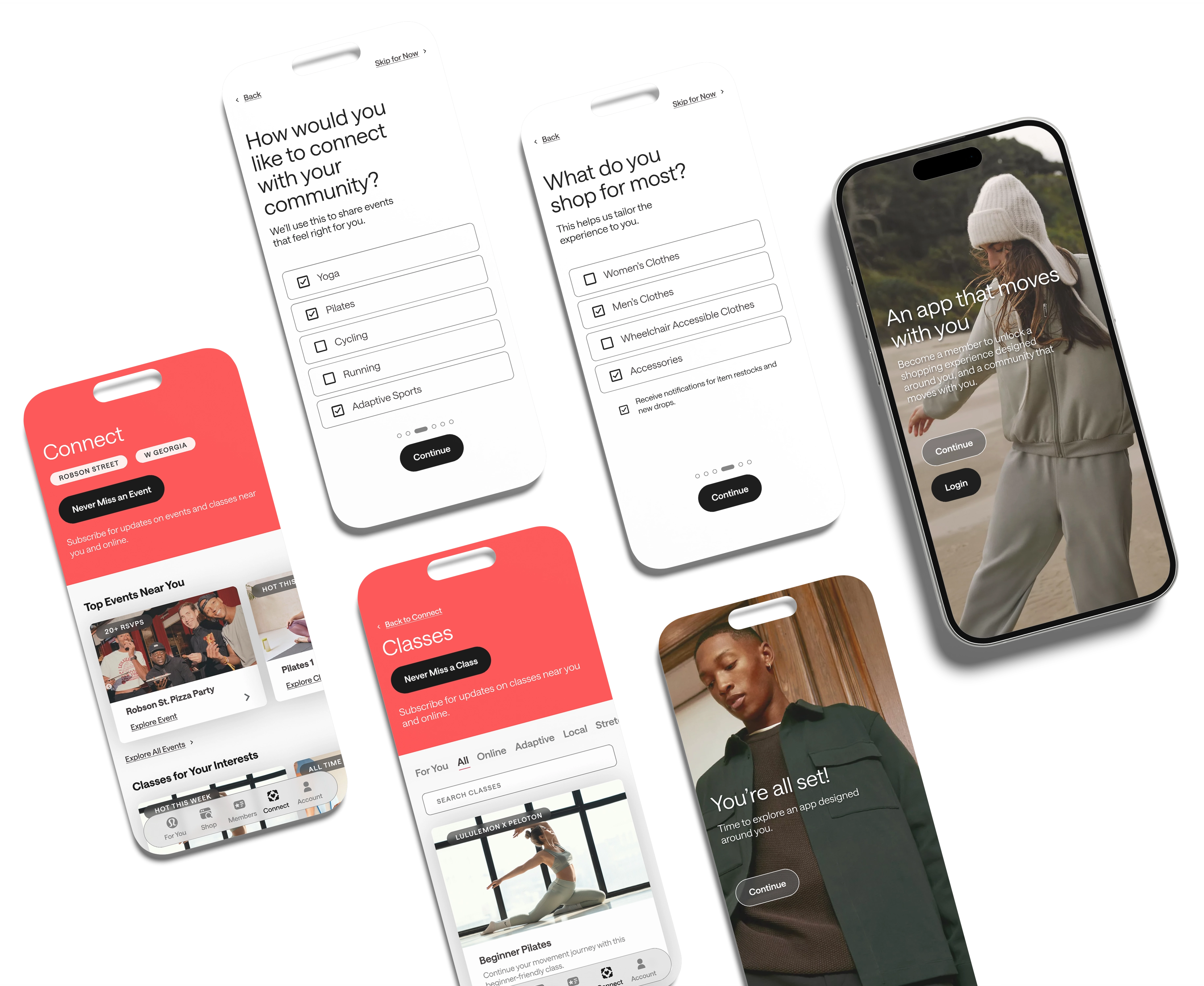
In four days, our team not only set out to understand why — but to design a path forward. What we found was less of a feature problem and more of a discovery problem: the community content existed, but users couldn't find it.
New and returning movement users can't find the classes and events that make lululemon special.
They're hidden behind membership screens with no clear path forward.
We ran a full heuristic evaluation using Nielsen's 10 usability principles — mapping a task flow from the home screen all the way to completing an online class, rating severity at each step.
The tricky part: the app had over 163K reviews and a 4.9/5 rating at the time. We had to look very carefully to find what that score was covering up.
Three of the biggest issues we identified across the app.
Movement classes have zero visibility from the home screen. Getting to one requires navigating multiple dead-end screens with no shortcuts and no sense of progress.

Heuristic #7:
Flexibility & Efficiency of Use
Major problem
Promotional clutter buries the features that matter most. The home screen tries to do too much, and users lose orientation before they've even started.

Heuristic #8: Aesthetic & Minimalist Design
Minor problem
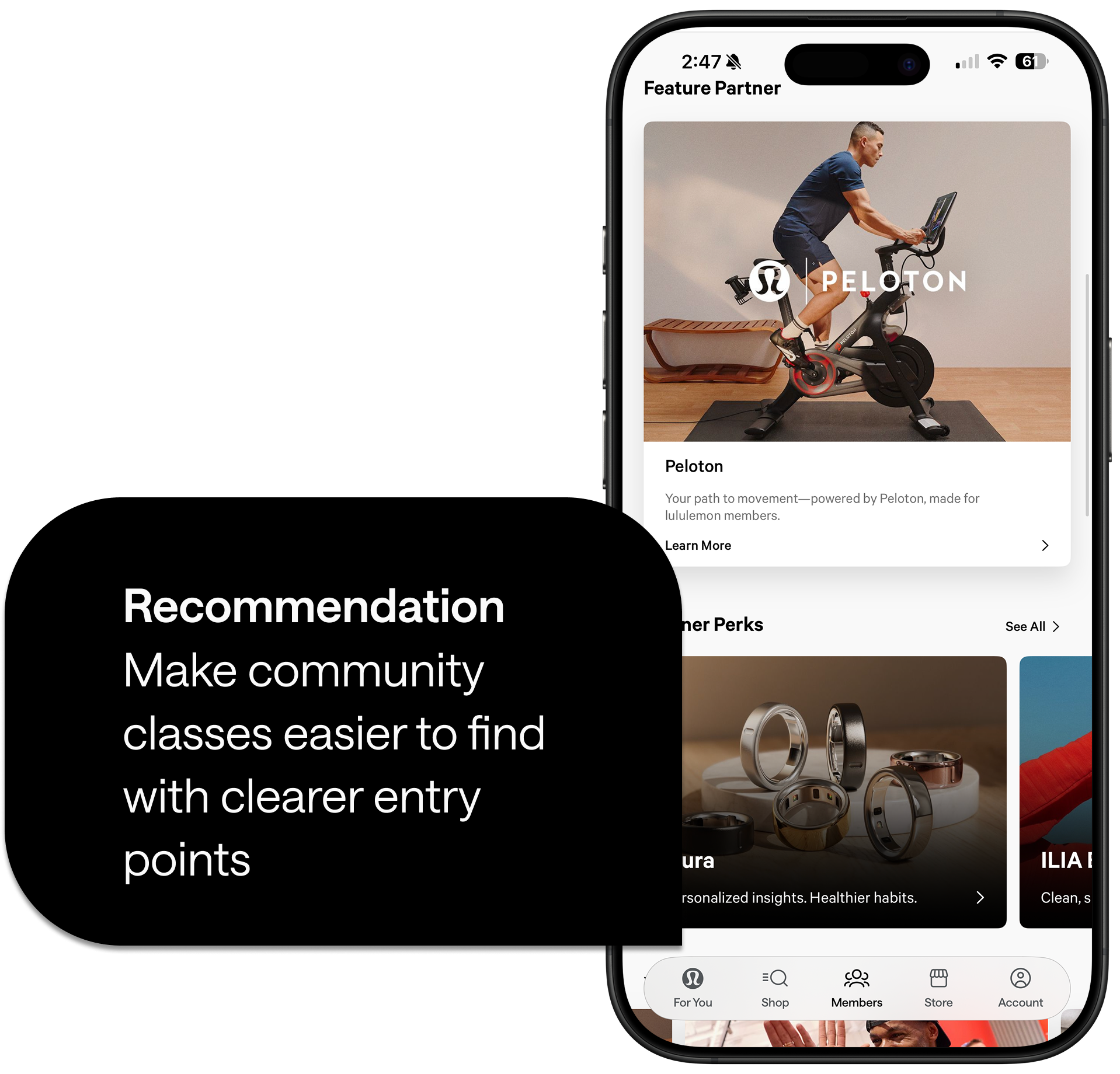
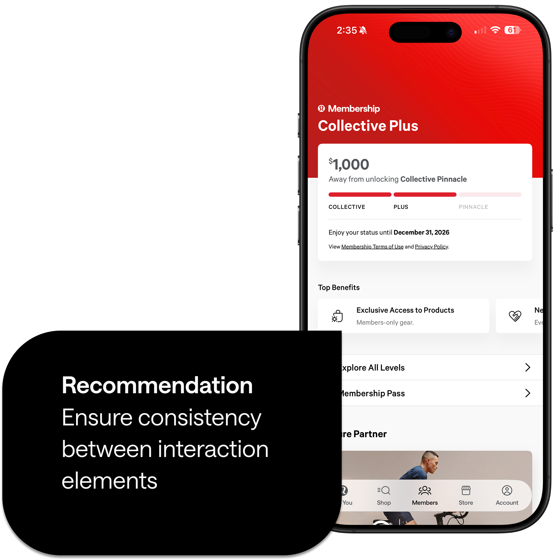
Top Benefits cards look interactive — they're not. A small repeated lie that erodes trust in the interface over time.
Heuristic #4: Consistency & Standards
Minor problem
Our solution rethinks how movement content and personalization surface
— in onboarding and throughout the app.
Six core decisions, all anchored to the same principle:confidence comes from clarity, not complexity.

Describing
design is one thing.
Feeling it, is another.

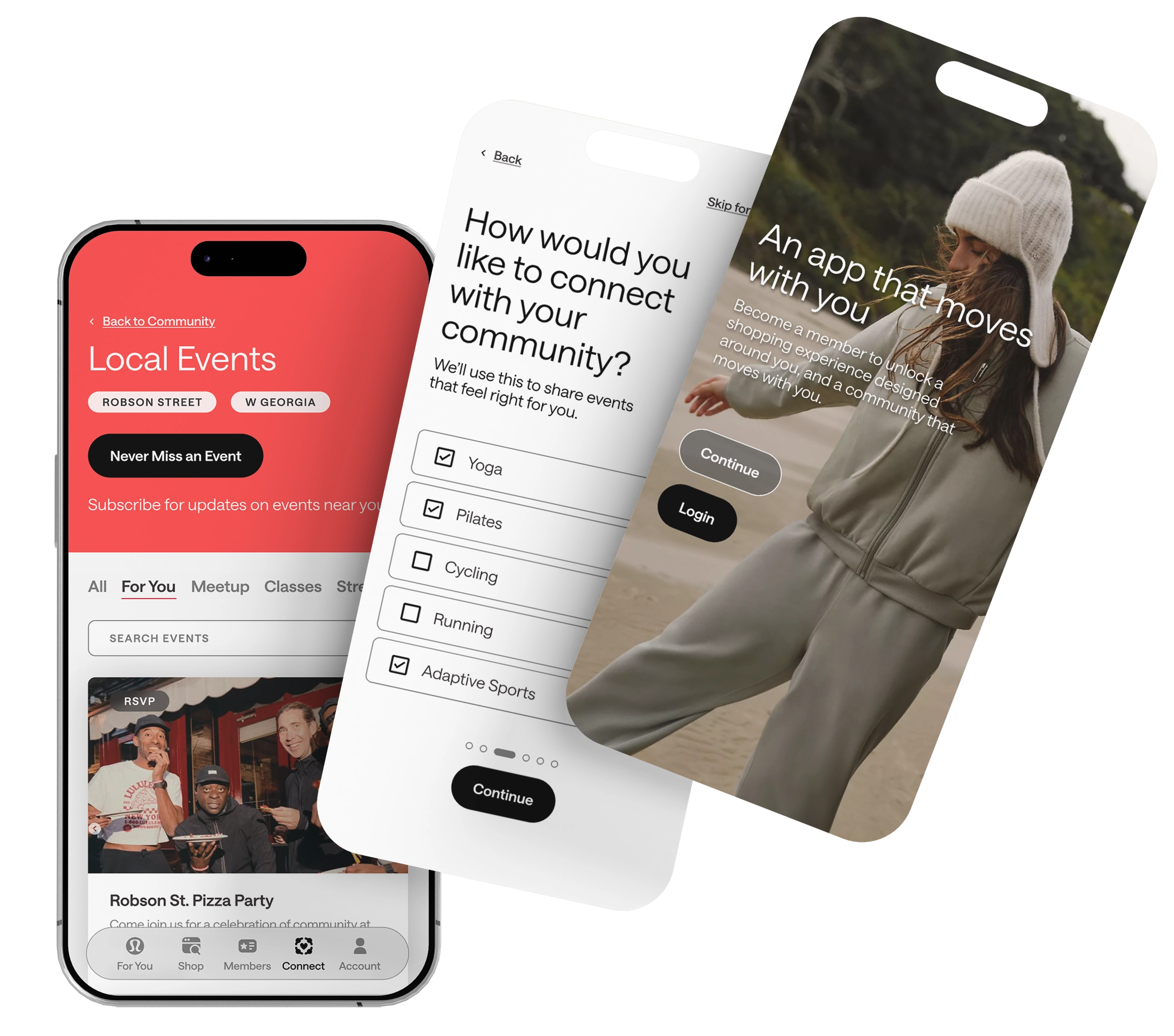
Personalized Onboarding
Asks what you need on day one, so the right classes surface immediately — not eventually.
Clearer Information Architecture
Three spaces, each with their own purpose. No overlap, no confusion.
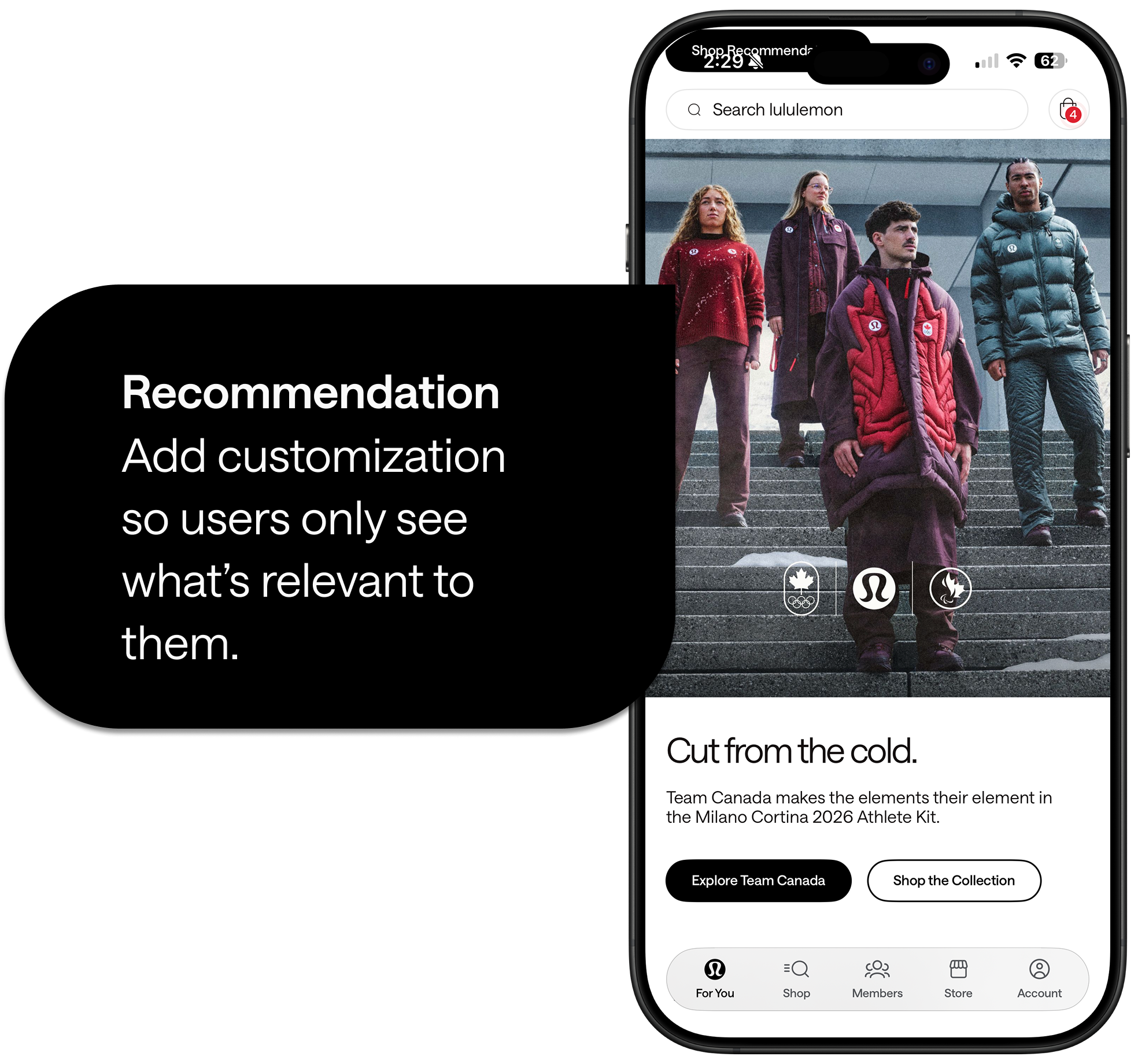
Multiple Entry Points
Community content is front and centre. No digging required.
Redesigned Class Experience
Answers the question before users have to ask it: is this class right for me?
Completion and Closure
Finishing a class isn't the end. A completion screen points users to what's next.
We set three goals at the start. Here's how the redesign delivered on each one.
Impact 01
Effortless Discovery
Visible entry points and personalized onboarding mean users no longer have to hunt to engage with the lululemon community.
Impact 02
Confident Decisions
Improved labels, filters, and detail pages give users the information they need to choose a class with confidence.
Impact 03
Continuous Movement
Completion screens and predictable navigation guide users forward instead of leaving them stranded.
Personalization isn't about adding features, it's about removing friction. The most valuable thing a 4-day deadline teaches you is what actually matters.
Version 02 starts here
A foundation, not a finish line
The next steps aren't just new features — they're ways the experience grows with the user. More contextual, more personal, more inclusive. Design that earns trust over time.
If you like what you see and want to work together, get in touch!