ui design
Standing bold in botanicals
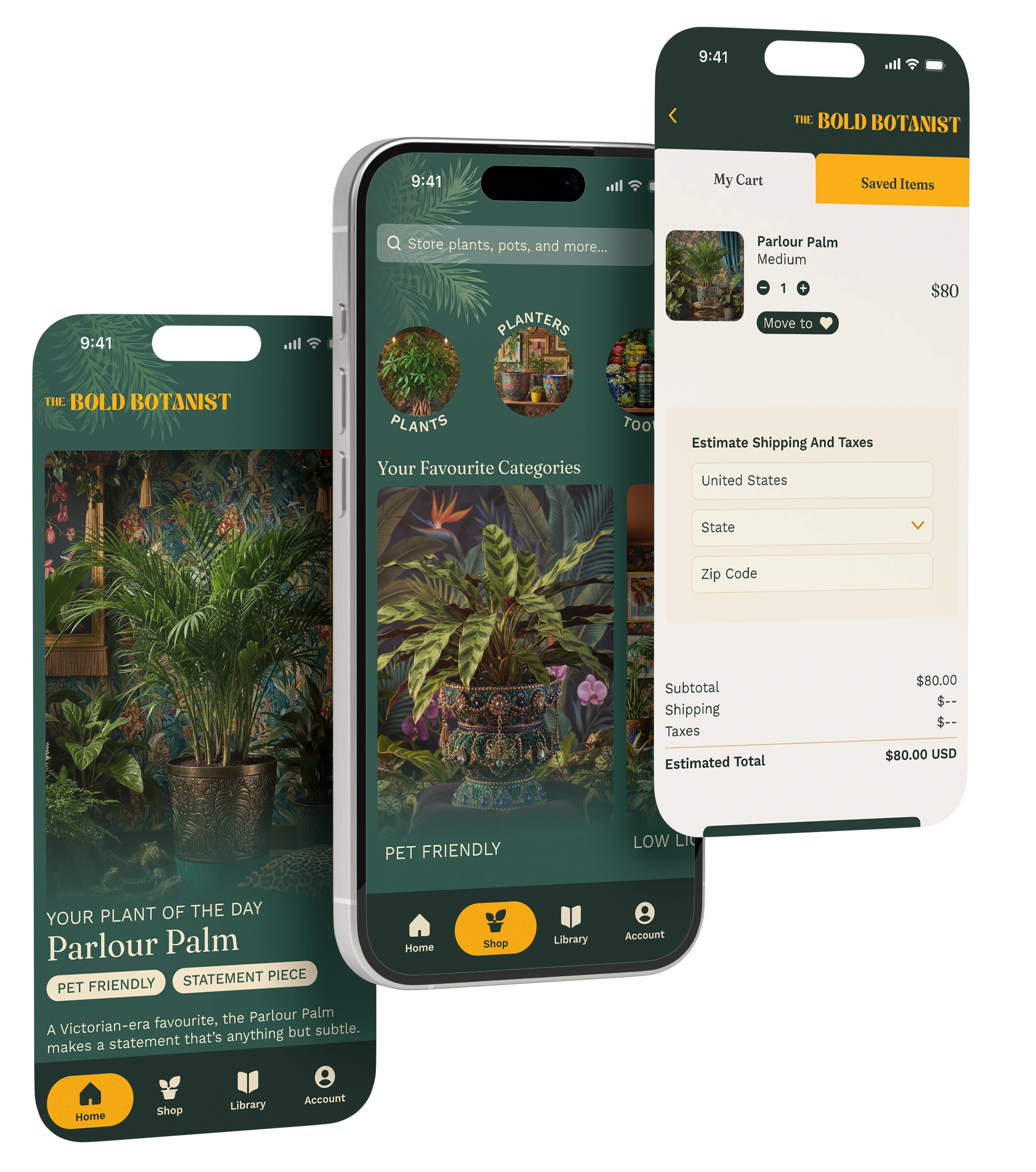
The Bold Botanist is a curated e-commerce platform for high-end houseplants and botanical decor.
The app celebrates living plants as sculptural elements and statement pieces, targeting confident, design-forward collectors who view their spaces as galleries and their plants as art installations.
The Brand Essence
"Grow boldly. Live lavishly."
As a solo designer, I was tasked with creating a comprehensive UI design system and visual direction that could transform raw research and brand positioning into a cohesive, production-ready interface.
The challenge wasn't just aesthetics—it was translating a feeling into a usable, functional application without sacrificing personality.
Before diving into UI, I had to first decide what the e-commerce app would sell. Once I decided on plants, I began to see what other shops were out there and how we could stand out.
Researching plant delivery e-commerce shops, I noticed the market lacks a shopping experience that matches the boldness and opulence of the products themselves. Most plant retailers lean toward minimalist, clinical interfaces and there was an opportunity to distrupt the current aesthetic of the market.
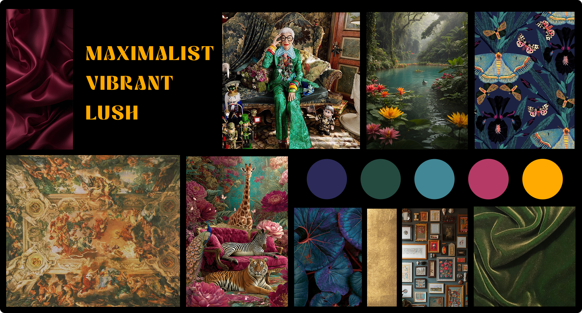
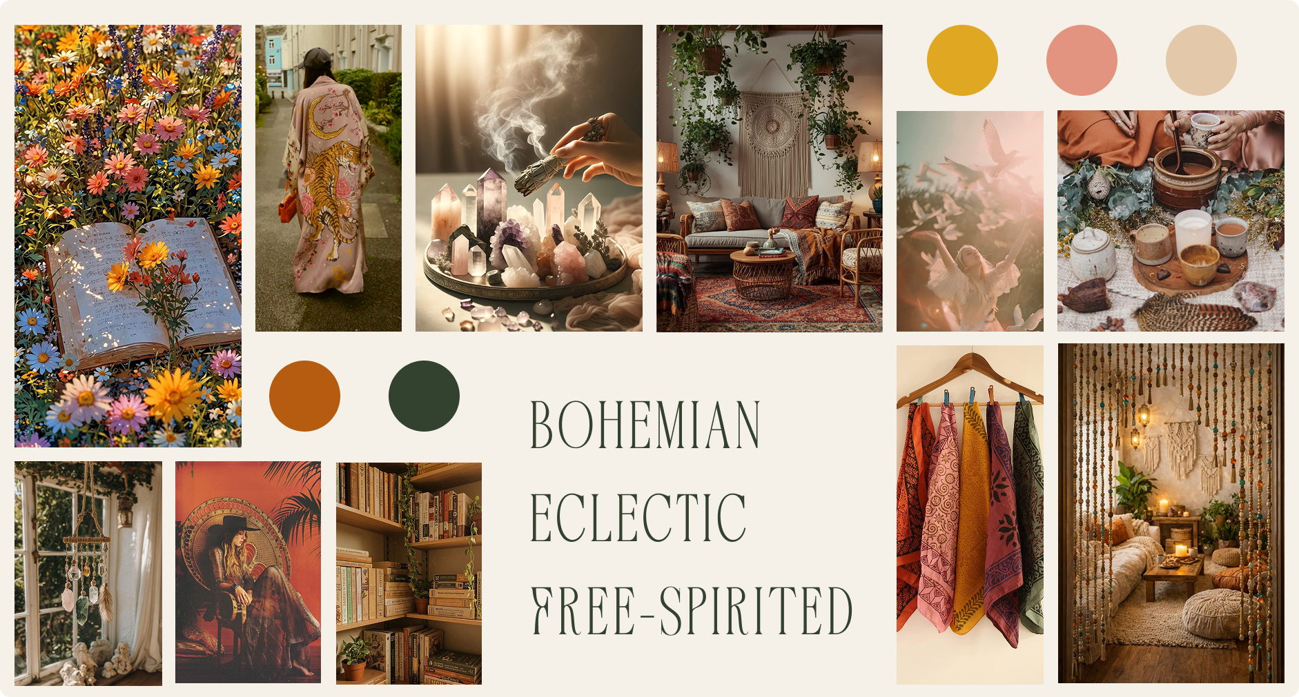
I explored three distinct visual directions to find the right voice for the brand. Each direction represented a different personality.
vibrant, lush
Opulent, mysterious, adventurous
More velvet than cotton, more jungle than desert.
Free-spirited, Eclectic
Vintage, collected, global, nomadic
More macramé than metal. More summer than winter.
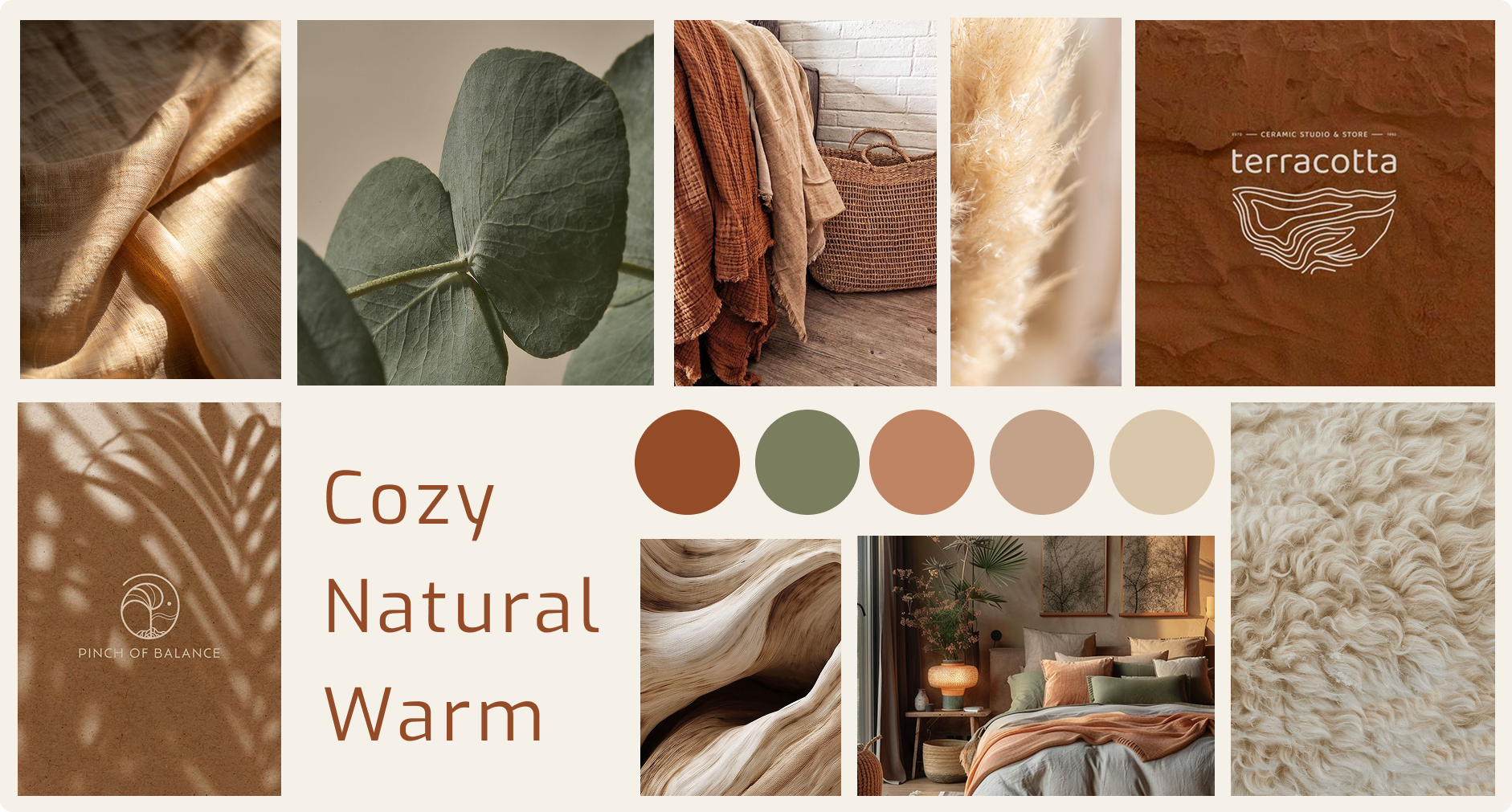
natural, warm
Soft, inviting, earthy
More wood than steel, more handcrafted than manufactured.
Why maximalist won
It stands out in the market and I saw the potential to reach a demographic that current plant shops weren't serving: confident, trendsetting collectors aged 28-45 in urban cities who value boldness and self-expression. They don't want understated; they want a living gallery. The maximalist direction gave us permission to layer rich colors, bold typography, dramatic imagery, and ornamental details without apology.
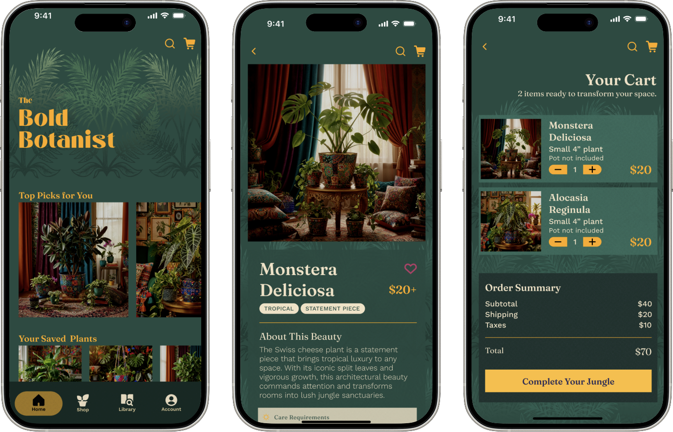
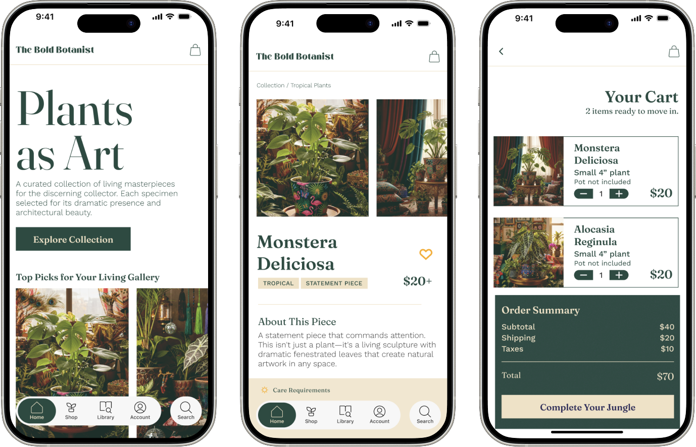
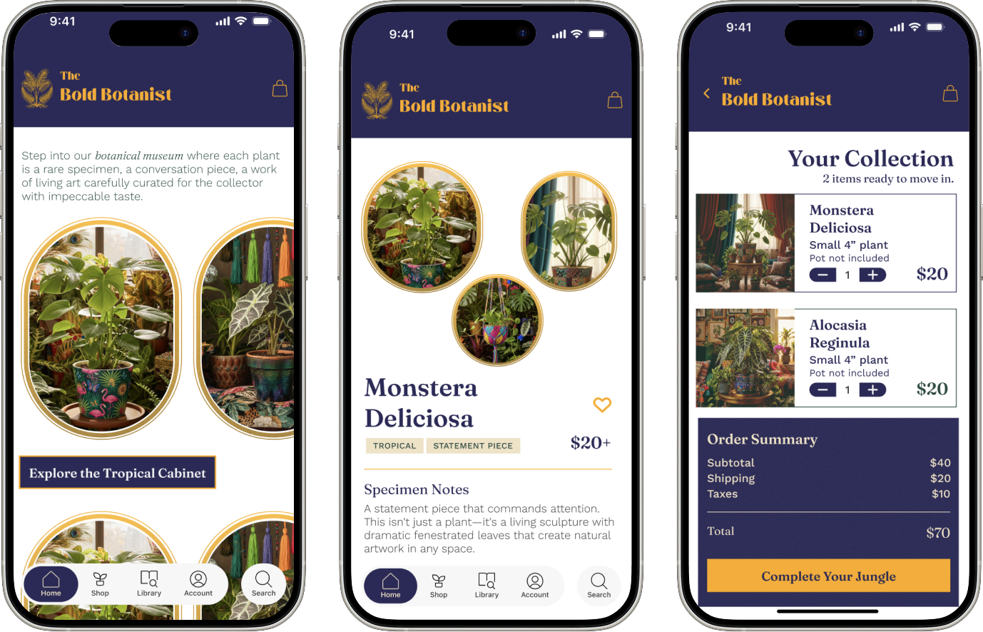
With the maximalist direction locked, I explored three distinct UI styles to see which best brought the brand to life while maintaining e-commerce functionality.
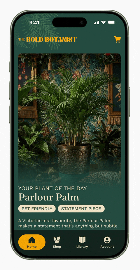
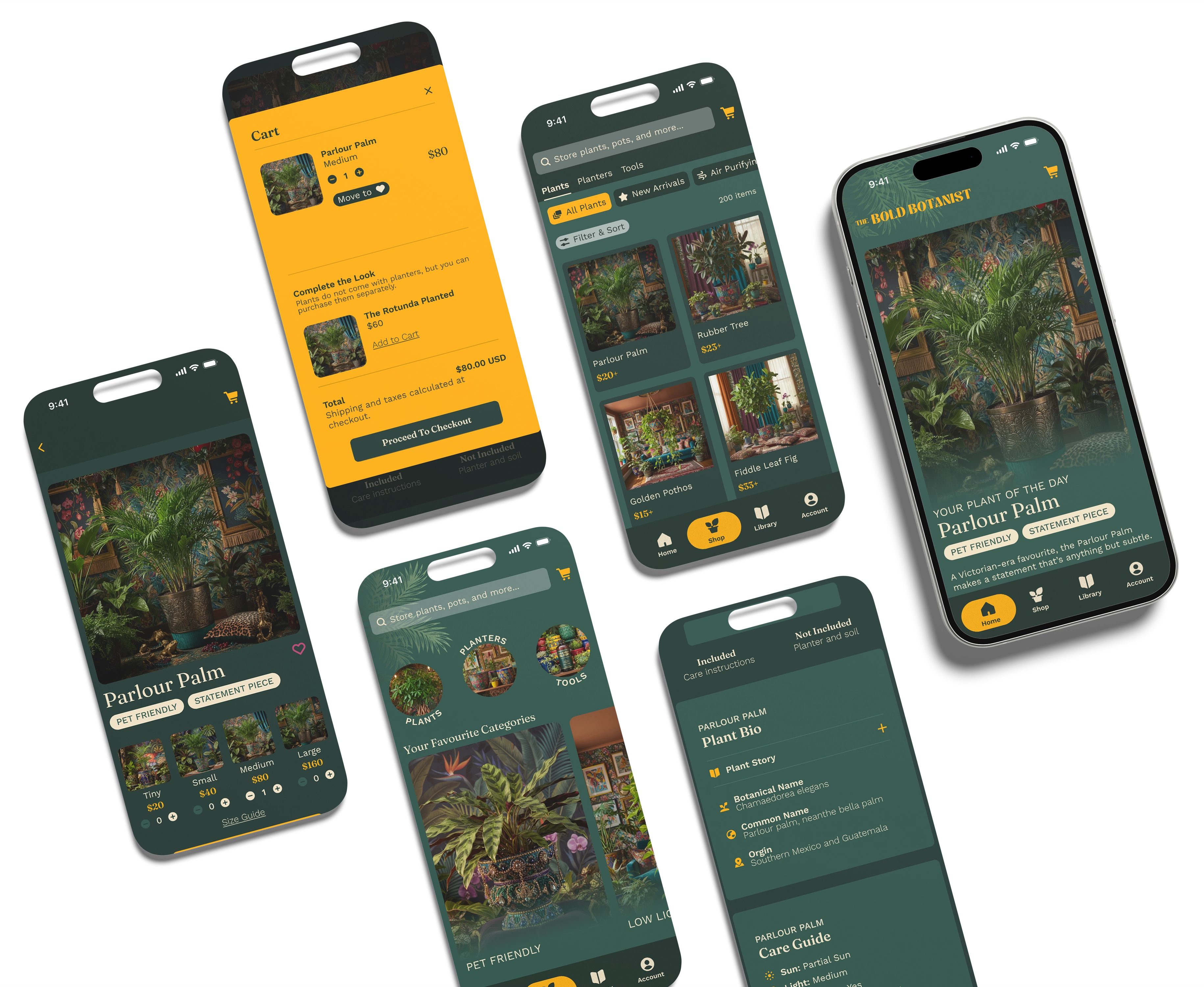
Layered, rich textures with lush plant imagery. Dark forest-green backgrounds with gold accents create moody, luxurious atmosphere. Celebrates the wild, untamed nature of plants.
Magazine-style editorial layout with dramatic typography and sophisticated grid systems. Clean, luxurious approach with generous spacing.
Collage-inspired layout with eclectic gold frames and modern fusion. Creates sense of a curated collection—like stepping into a botanical museum.
How the final design differentiates the brand.
The Jungle Maximalism approach won because it fully commits to the visual identity while maintaining functional e-commerce design. Dark, moody backgrounds layered with rich plant imagery and gold accents create a premium, luxurious feeling that stands out from the sea of white, minimal plant apps.
Describing
design is one thing.
Feeling it, is another.

Dark, moody base
Forest-green backgrounds create atmosphere and drama. Plants feel like living sculptures against this backdrop.
Lush plant imagery
High-quality product photography showcasing textures, details, and the plant's sculptural presence. Not just product shots—art direction.
Gold accents and details
Warm gold typography, borders, and UI elements create luxury and warmth against the cool dark backgrounds.
Layered composition
Plants overlap, photography layers, pattern and text interact. Creates depth and visual interest without feeling chaotic.
What the design solved:
Impact 01
Production-ready UI system
Transformed a bold brand identity into a functional, production-ready UI system.
Impact 02
Scalable design
Created a scalable design system (components, color variables, spacing rules) for future expansion.
Impact 03
Balanced design
Balanced aesthetic maximalism with e-commerce usability—no compromise on either.
Impact 04
Consistent design
Established a clear pattern language for product discovery, checkout, and account management.
Bold doesn't mean chaotic: The biggest insight from this project was that maximalism requires even more intentionality than minimalism. Every element had to earn its place. The dark backgrounds, the gold accents, the layered compositions—all of it had to serve the brand identity and maintain usability. Abundance needs architecture.
Market gaps often exist in aesthetics: Functionally, plant e-commerce apps don't need much. The differentiation here came entirely from visual identity and brand positioning. By committing to a bold aesthetic that stood apart from industry norms, The Bold Botanist creates an immediate, memorable positioning.
Visual direction exploration matters: I tested three directions before settling on one. That process wasn't wasteful—it clarified why maximalism was the right choice. It gave me confidence in the decision and understanding of what made it unique.
Version 02 starts here
If you like what you see and want to work together, get in touch!